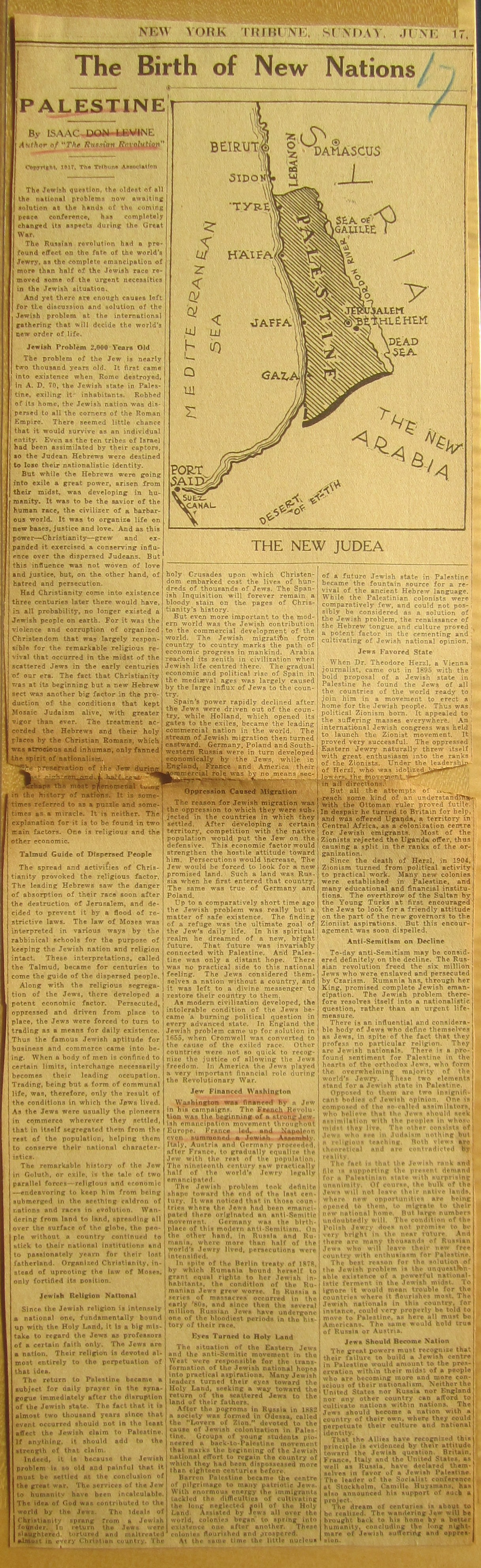
Nick Danforth, Georgetown University
View Istanbul Food Map at full size
To celebrate the end of Ramadan and the beginning of the fall eating season (August 15-October 31st), we are posting our official Istanbul Food Map. Developed after much arguing with collaborators (thanks go to to Irina Levin, Chris Trapani and H.G. Masters), this map shows some of the best places to eat some of the best foods in the city, as well a bunch of others. I realize many visitors to this site are either natives of the city themselves or longtime residents, who will have their own strong, quite possibly more qualified, opinions on these issues. Everyone is free to disagree (except about lades, which really is unarguably the best menemen in the world), Consider this, at least, something to send to friends who email asking for recommendations about where to go and what to eat in Istanbul. As a recent New York Times article on "food sherpas" revealed, many people are apparently incapable of doing something as basic as eating on their own without some kind of pseudo-professional advice. While I have aways enjoyed Istanbul Eats, I am troubled by the idea that a visitor searching for, say, good kokoreç would be better off having the site's advice instead of simply the good sense to stop when they saw someone selling kokoreç.
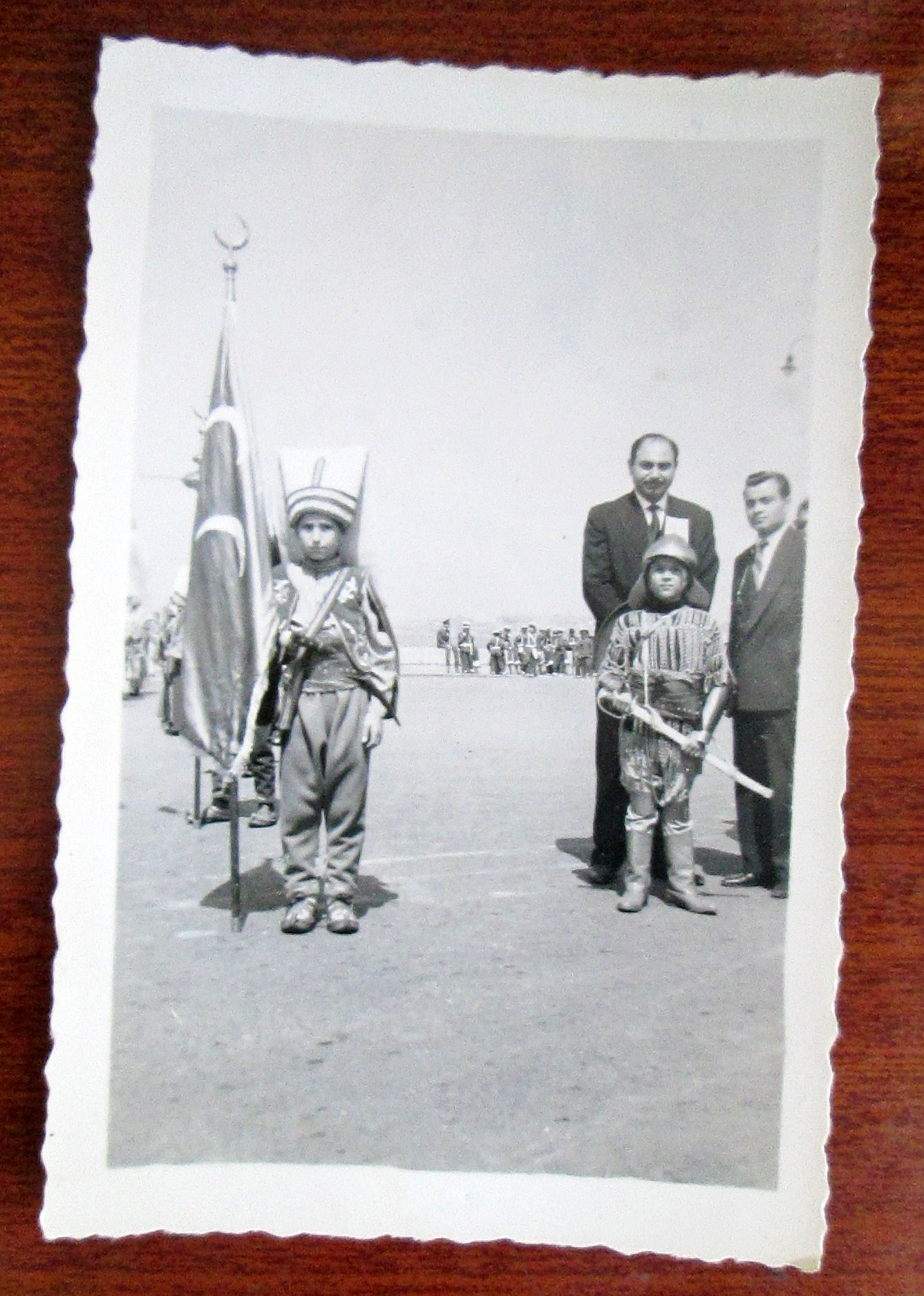
In that spirit, many of the recommendations on this map are arbitrary, outdated, or downright inaccurate. Is their any reason to go the Üsküdar for çiğ köfte? of course not. it tastes the same at chains around the city. But why not? likewise, Haci Baba's was replaced by some Antakya medeniyet sofrasi years ago, as part of a regrettable trend of mediocre restaurants trying to capitalize on Antakya's hard-earned reputation for excellent cuisine. Until they start making better hummus, this map won't recognize them. fınally Sinerji has never actually served Efes, but it also refuses to servee Bomonti, which is pretty much the best you can hope for now.
Anyways, if you or anyone you know is planning a trip to Istanbul, here are some places to consider.
Çiğ Köfte (Spice Bulgur Meatballs): These used to be made with raw meat, but are now, by law, entirely vegetarian. You can't tell the difference until the next morning when you realize you aren't sick
Efes (Beer, plus a certain percentage of water): Sinerji Bar. Beer is ordered by size. Otuzluk for a small, ellilik for a large.
Iskender (Yogurt) Kebab / Beyti (wrapped) Kebab: Cihangir Kebab Shop. You can get the 1.5 portion if you're worried about not having enough
![]() Karnıyarık, Imam Bayıldı (Stuffed Eggplant): Haci Baba. Pretty much anything with eggplant here is great
Karnıyarık, Imam Bayıldı (Stuffed Eggplant): Haci Baba. Pretty much anything with eggplant here is great
Kokoreç (Lamb Intestine): Kadıköy Bazaar. Specifically, there's a place on the right as you're walking up to the bazaar that's good. The intestine is so well fried and spiced it hardly tastes like intestine anymore
Mantı (Turkish Ravioli): Kardeşim Lokantası. There's a lot of mediocre manti in the world. Kardeşim has some of the best in . The dried yogurt topping tastes just like parmasan cheese
Menemen (Turkish Omelet): Lades Khavaltı Salonu. Peynirli (with cheese), Sucuklu (with sausage), or Pastırmalı (with pastrami) recommended. The cream and honey plate is also, obviously, delicious
Midiye Dolma (Stuffed mussles): Kumkapı Neighborhood. Midiye Dolma were traditionally associated with the city's Armenian community. The Armenian patriarchate can still be visited near kumkapı.
Sahlep (warm, thick winter beverage): At Saray, you can sit outside and sip salep in the winter. Salep is unique: it's a sweet, thick creamy beverage made from flour ground from the roots of orchids, with lots of spices added in.
Tea: Istanbul Deniz Otobusleri Ferryboats. Everything is better on boats, including tea. In the winter, you can also get Sahlep, either on deck or from the boat cantina
To celebrate the end of Ramadan and the beginning of the fall eating season (August 15-October 31st), we are posting our official Istanbul Food Map. Developed after much arguing with collaborators (thanks go to to Irina Levin, Chris Trapani and H.G. Masters), this map shows some of the best places to eat some of the best foods in the city, as well a bunch of others. I realize many visitors to this site are either natives of the city themselves or longtime residents, who will have their own strong, quite possibly more qualified, opinions on these issues. Everyone is free to disagree (except about lades, which really is unarguably the best menemen in the world), Consider this, at least, something to send to friends who email asking for recommendations about where to go and what to eat in Istanbul. As a recent New York Times article on "food sherpas" revealed, many people are apparently incapable of doing something as basic as eating on their own without some kind of pseudo-professional advice. While I have aways enjoyed Istanbul Eats, I am troubled by the idea that a visitor searching for, say, good kokoreç would be better off having the site's advice instead of simply the good sense to stop when they saw someone selling kokoreç.
In that spirit, many of the recommendations on this map are arbitrary, outdated, or downright inaccurate. Is their any reason to go the Üsküdar for çiğ köfte? of course not. it tastes the same at chains around the city. But why not? likewise, Haci Baba's was replaced by some Antakya medeniyet sofrasi years ago, as part of a regrettable trend of mediocre restaurants trying to capitalize on Antakya's hard-earned reputation for excellent cuisine. Until they start making better hummus, this map won't recognize them. fınally Sinerji has never actually served Efes, but it also refuses to servee Bomonti, which is pretty much the best you can hope for now.
Anyways, if you or anyone you know is planning a trip to Istanbul, here are some places to consider.
Çiğ Köfte (Spice Bulgur Meatballs): These used to be made with raw meat, but are now, by law, entirely vegetarian. You can't tell the difference until the next morning when you realize you aren't sick
Efes (Beer, plus a certain percentage of water): Sinerji Bar. Beer is ordered by size. Otuzluk for a small, ellilik for a large.
Iskender (Yogurt) Kebab / Beyti (wrapped) Kebab: Cihangir Kebab Shop. You can get the 1.5 portion if you're worried about not having enough
 Karnıyarık, Imam Bayıldı (Stuffed Eggplant): Haci Baba. Pretty much anything with eggplant here is great
Kokoreç (Lamb Intestine): Kadıköy Bazaar. Specifically, there's a place on the right as you're walking up to the bazaar that's good. The intestine is so well fried and spiced it hardly tastes like intestine anymore
Mantı (Turkish Ravioli): Kardeşim Lokantası. There's a lot of mediocre manti in the world. Kardeşim has some of the best in . The dried yogurt topping tastes just like parmasan cheese
Menemen (Turkish Omelet): Lades Khavaltı Salonu. Peynirli (with cheese), Sucuklu (with sausage), or Pastırmalı (with pastrami) recommended. The cream and honey plate is also, obviously, delicious
Midiye Dolma (Stuffed mussles): Kumkapı Neighborhood. Midiye Dolma were traditionally associated with the city's Armenian community. The Armenian patriarchate can still be visited near kumkapı.
Sahlep (warm, thick winter beverage): At Saray, you can sit outside and sip salep in the winter. Salep is unique: it's a sweet, thick creamy beverage made from flour ground from the roots of orchids, with lots of spices added in.
Tea: Istanbul Deniz Otobusleri Ferryboats. Everything is better on boats, including tea. In the winter, you can also get Sahlep, either on deck or from the boat cantina